What is a stacked chart?
A stacked chart is a form of bar chart that shows the composition and comparison of a few variables, either relative or absolute, over time. Also called a stacked bar or column chart, they look like a series of columns or bars that are stacked on top of each other. Stacked charts are an incredibly effective tool for comparisons when used correctly. They are designed to compare total values across categories.
Stacked charts have a very narrow set of uses. Because of their limitations, there are only a few scenarios where they are ideal, but when these criteria are met, they can be a powerful tool and method of presentation. They can help graphically present a story of sales or population information.
Bar charts in general are attributed to William Playfair, a Scottish man who published the first bar graphs in the late 1700’s.
When should a stacked chart be used?
There are a small range of scenarios when a stacked chart should be used. The objective of a stacked chart is to compare numerical values of a categorical variable and the decomposition of each bar. Ideally, the chart should:
- Have numeric values
- Have one or two categorical variables that can be broken down
- Have regular date intervals
- Be designed for comparison purposes only
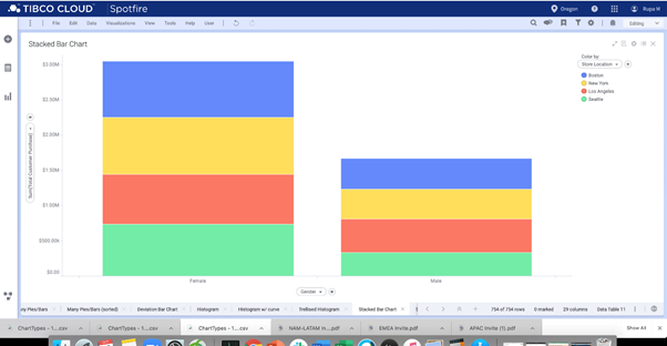
For a business, an ideal use for a stacked chart is to show sales volumes. For instance, breaking down sales of electronics at different stores across the US. This can be further subdivided into categories such as male or female purchase values.
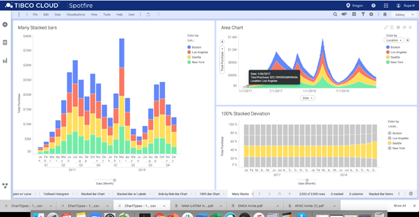
Then, more sophisticated stacked bar charts can be created. For instance, sales could be tracked across a time period, showing sales values at a number of different branches.
Stacked charts are also ideal for comparing population data and information. For example, comparing age groups for a set of options. Is there variance among age groups about preferred fruits? A stacked chart will show this type of data set easily.
Another common use for stacked charts is when something has been measured using a Likert scale. For instance, a university may survey all the students and ask for enjoyment levels of a particular course. This can then be shown in a stacked chart, either as a single bar or grouped by major type.
Best practices for stacked charts
There are similar practices for bar charts as stacked charts. However, adding another categorical variable adds a layer of complexity.
- Consistency of scale: As with all charts, the axis must start at zero, and the scale must be even and consistent to avoid flawed charts.
- Good labelling: Headings, labels, and a key should be used if there is ambiguous data.
- No negative values: A stacked chart cannot have negative values, as these cannot be displayed on the same bar. The negative values would offset the positive values. Unless there are consistent negative and positive values that can be plotted on the same chart using two axes, there is no way to show them both and a true total.
- Category levels must be considered: The order of categories must be considered, and they must be consistent across all the bars. In general, it should be overall from largest to smallest, in both individual bars with the most important value at the bottom of the chart, but also from left to right unless there is an intrinsic order of levels. However this is achieved, it must be consistent across all bars or columns.
- Effectiveness of colors: The color choice is very important in stacked charts. There are a number of ways to do this well, depending on the data.
- A sequential palette might be used when the variable is continuous like age groups. The younger age group could be a light pink, while the oldest group could be a deep red.
- A qualitative palette could signify an action, for instance a click could be green and a close window could be red
- The final option is a diverging palette, which is ideal for something like a Likert scale, where a strongly agree could be green, and a strongly disagree could be red.
Variations to stacked charts
Horizontal stacked bar chart
Much like the standard vertical stacked chart, horizontal stacked bar charts are simply oriented sideways, generally running from left to right. These are better to use when there are many totals, as the width of a viewer’s screen is always limited, where the height is not. This means that data can be viewed on one screen, rather than scrolling up and down to compare areas and information.
Percentage stacked bar chart
For this chart, each bar is scaled to 100 percent, so every bar on the chart has the same height. This makes it more difficult to analyze the primary category totals but is far easier for the secondary distributions.
Advantages of stacked charts
Easy to see changes overall
A stacked graph immediately and clearly shows the total changes in a variable. For instance, the total sales in a branch of an electronics store.
Outliers are easy to see
When looking at a stacked chart, it is incredibly easy to see outliers. Whether it is a change in product volume sales over time or a one-off difference, the visual display is very easy to interpret.
Can save space
If there is a need for multiple charts in a report, a series of stacked charts can save a lot of space. Multiple stacked charts can be presented vertically or horizontally and will take up less space than multiple graphs of other types.
Disadvantages of stacked charts
Can be difficult to interpret
While it is easy to compare the total values for a stacked chart, the individual divisions can be hard to see, particularly the middle variable. Because the base level has changed, there is a reliance on being able to judge spatial distances easily, and if that is not possible then the baseline shift makes it difficult to see changes of other variables.
Solution
If subgroup comparisons are important, then consider a line chart or grouped bar chart. Or, add annotations to the bar and values so they are labelled clearly. If the data significantly changes, for instance one variable overtook or substantially changed over another, then a stacked chart does not clearly show this. A line chart is a far better alternative.
Can become crowded
If there are too many variables, a stacked chart can become hard to read and interpret.
Solution
Keep it simple with fewer variables on each bar and in each chart.
Alternatives to stacked charts
Pie chart
When there is only one bar, a pie graph could be the best alternative to use. While they are still difficult to interpret at times, they present information clearly, and it is easier to see the middle variable quantities. However, only use a pie graph if there is one data set.
Area chart
If the primary variable is continuous, an area chart may be the better way to present the data. Rather than a number of bar charts, the connected nature of the area chart can emphasize the continuous data.
Grouped bar chart
Unstacking those bars and placing the variables next to each other makes it far easier to see variations to individual elements. It is a trade off though, as the chart no longer clearly shows the totals of the categories. Choose what is important to the chart to convey.
Marimekko Chart/ Mosaic Chart
If data is simply too complex for a stacked chart, then a Marimekko chart may be a good alternative. These charts basically split a stacked bar chart into two directions. While this makes interpretation more difficult as the viewer needs to compare box areas, it is more suitable for multiple data variables.
