Solve high-stakes
industrial decisions
Industry-native, designed for
expert-driven decisions.
Spotfire® Industry Pro is designed for when teams need to understand what is happening, why it is happening, and what to do next.
In industrial environments, decisions around development, optimization, quality, reliability, and risk require more than visual exploration. Industrial systems are multi-domain, high-dimensional, and interdependent. Experts must investigate behavior, not just visualize data, to understand why systems behave as they do. They demand statistical rigor, predictive modeling, scenario analysis, and workflows that can be trusted, explained, and repeated.
Spotfire Industry Pro brings these capabilities into the same visual environment, allowing engineers and scientists to move from discovery to prediction to action without fragmented tools, handoffs, or opaque models.
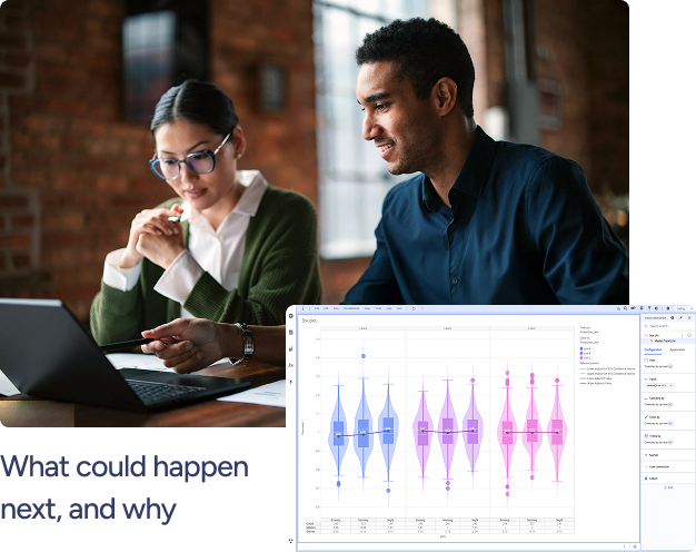
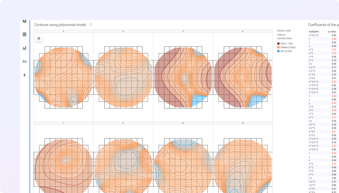
Predict outcomes and assess risk, before decisions are made
Spotfire Industry Pro enables domain experts to build, validate, and apply predictive models directly within visual workflows. Teams can explore uncertainty, test scenarios, and understand surface risk sensitivity earlier, making decisions more defensible.
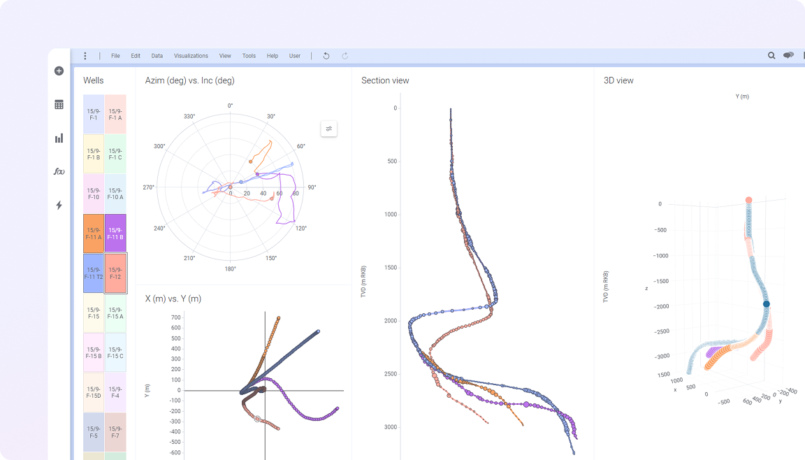
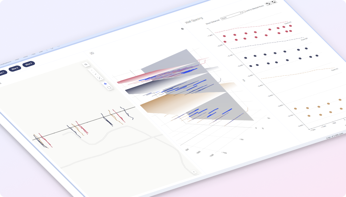
One decision layer for industrial complexity
Spotfire provides a shared industrial analytics decision layer where experts explore complex data, add context directly into analysis, and collaborate across domains. Visual exploration, industry-aware workflows, and explainable AI help teams surface risks earlier, understand complex behavior, and move faster from fragmented insight to confident action.
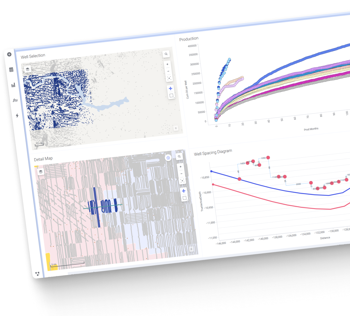
Solve industry-specific problems with confidence
Spotfire Industry Pro includes domain-aware analytics and visual workflows designed for real industrial use cases, from yield and quality analysis to production optimization and reliability modeling, to name but a few. This ensures advanced analytics are applied in context, not abstracted from reality.
Designed for industrial rigor,
not experiments
Advanced analytics in industrial environments must be trusted, explainable, and governed. Spotfire Industry Pro is built with these requirements in mind. Models are transparent. Assumptions are visible. Workflows are auditable and repeatable. This makes it possible to apply advanced analytics in environments where decisions carry real financial, operational, and safety consequences.
Advanced analytics you can trust
Advanced analytics you can trust Spotfire Industry Pro brings advanced modeling, AI-assisted intelligence, and industry-specific workflows into a single visual decision layer. By keeping experts in control and making analytics explainable and repeatable, Spotfire Industry Pro enables organizations to move from insight to confident action, even when decisions are complex and the stakes are high.