What is an area chart?
An area chart is a graph that combines a line chart and a bar chart to show changes in quantities over time. It’s similar to a line graph in that data points are plotted and connected by line segments. However, the area below the line is colored in or shaded. Then, other values are plotted below the lines and shaded in a different color, resulting in a chart with layers.
William Playfair developed area charts, the first of which he published in his 1786 book. This book, The Commercial and Political Atlas, contained a number of time-series graphs that showed national debt and import and export data. Playfair is also the inventor of the bar, pie, and line charts.
Types of area charts
Overlapping area chart
This chart compares values between groups and shows the data overlapping. For instance, a graph might show sales of iPhones, and as sales of one type of phone peaks and starts to fall, another model is introduced. There will be an area of crossover, but the chart will clearly show peaks of sales and then drop-offs. The cross-over is emphasized by the transparent shading.
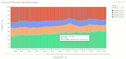
Stacked area chart
This chart is most commonly referred to as an area chart, and that’s also how we’ll refer to it in this article. While the overlapping area chart uses transparent shading to show crossover, a stacked area chart uses solid colors or patterns. A stacked chart is used when tracking total value and the breakdown of that total over groups. It is easy to compare the height of the stacked area to see how one group performs against another.
When to use an area chart
An area chart is ideally used to show differing trends over time. It is best used when:
- There is data expressed as a total
- There are time periods to compare
- The point of the chart is to communicate an overall trend, not individual values
- There are multiple data series with part-to-whole relationships, or a cumulative series of values
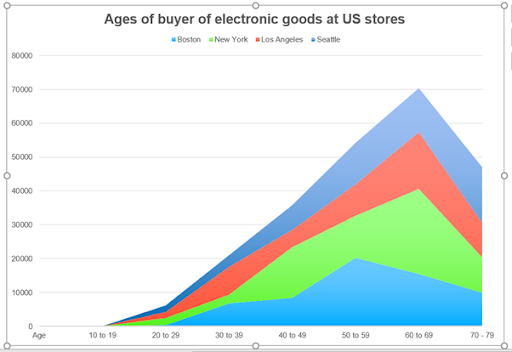
Consider the example of sales overtime in an electronics chain. The three variables are purchasers’ ages, store location, and sales value. This example clearly shows that people in the 60-to-69 age group comprise the bulk of electronics purchasers.
However, the graph is misleading because it makes it seem like the city of Boston has the largest amount of sales. However, this figure is just the percentage of the overall volume; it’s actually Seattle that has the largest amount of sales in the 60-to-69 age group. This is the biggest problem with area charts; they can be misleading and hard to interpret.
Area charts are ideal when the total figures are as important as the share of the figure. If the values for each time period add up to 100 percent, this is where area charts shine.
If there are big differences in the values of your data, an area chart is an instantly understandable way to show the data.
When not to use an area chart
Area charts are only useful for a specific set of circumstances. There are far better alternatives for most other data sets:
- If you want to show how values differ across a range of different categories, an area chart is not ideal. Instead, consider using a bar chart, column chart, or split bar chart.
- If the data total is not important, an area chart could be misleading and not provide the full information. A line chart will likely be easier to read and understand, such as in the example of the electronics sales chart shown above.
- If the differences between values are small, a line chart is preferable. This is because its Y-axis doesn’t have to start at zero and can be stretched to show even tiny differences.
- If the chart is only showing one value over time, or there are only a few dates to plot, a line chart or column chart is better, and labelling is superior. If there are ten or fewer dates, a stacked column chart is easier to read.
- If you are comparing the size of different shares, a line chart is a better way of presenting the information.
Line chart versus area chart
The area chart is a descendent of the line chart and is often used when a line chart would be a far better option. A line chart is preferable when there are multiple different series, and these series need to be compared against one another. Line charts can accurately display approximately seven lines. Area charts are not as effective at comparing that many series because the areas become occluded. While this issue can be resolved using translucent colours or shading, these solutions just highlight the fact that a line graph would have been a better choice in this occurrence.
But when data has a total, or a percentage of 100 percent, that is when an area chart should be used. A line graph can show a net change of sales change over time, while an area chart shows the total sales over time. This differentiation is important because it shows when a line chart is more informative and suitable than an area chart.
Variations to area charts
Step-area charts
These charts show when an area chart uses horizontal and vertical lines connecting the data points rather than direct lines, creating a step-like progression.
Spline-area charts
Rather than a straight line connecting the points, a spline area chart uses smooth curves that create a much smoother, more organic-looking chart.
Streamgraphs
When an area chart has a displaced area around the central axis, this is called a streamgraph. It usually has curves connecting the points to give it a free-flowing, stream-like appearance. It is excellent when data has both negative and positive figures on the Y-axis.
Smoothed-line charts
In these charts, line graphs are smoothed over, looking more like a ski slope than a scientific or mathematical chart. While this may be visually appealing, it can distort the data and make it more difficult to interpret.
Benefits of area charts
Area charts, when used in the correct way, provide instantly visible information. The viewer can see a range of values that change over time. They look great, with big blocks of color that make them attractive and easy to interpret. The colors visually represent volume, making a correctly used area chart highly understandable.
Challenges of area charts
Area charts can be misleading because the chart plots figures vertically, but people see the thickness of the image as showing the share of the outcome. Rearranging the layout can help change how the data is visualized, but often another graph style is more appropriate. Interpreting values on individual groups are only really clear for the total, front, and bottom group.
How to create better area charts
With a few simple changes, area charts can be made easier to read and show the data more clearly. First, establish if an area chart is your best solution. Is there change over time, does the data show a total, and is the chart designed to show cumulative change over time? If these three criteria are met, then create your area chart with these imperatives in mind:
- Remember that the most important value should be at the bottom (front) of the chart
- Turn off automatic labelling and place manual labels in the colored area
- Include a zero baseline
- Use annotations or highlighted ranges to help explain the chart
- Consider groups of tiny values into one bigger value to clean up the chart’s appearance
- Remember that an area chart is rarely the best option; look at line and bar charts first
