What is a pie chart?
A pie chart is a graphical representation technique that displays data in a circular-shaped graph. It is a composite static chart that works best with few variables. Pie charts are often used to represent sample data—with data points belonging to a combination of different categories. Each of these categories is represented as a “slice of the pie.” The size of each slice is directly proportional to the number of data points that belong to a particular category.
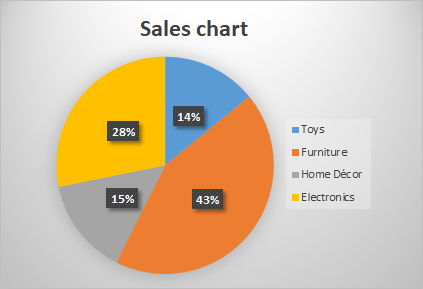
For example, take a pie chart representing the sales a retail store makes in a month. The slices represent the sales of toys, home decor, furniture, and electronics.
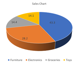
The below pie chart represents sales data, where 43 percent of sales were from furniture, 28 percent from electronics, 15 percent from toys, and 14 percent from home decor. These figures add up to 100 percent, as should always be the case with pie graphs.
Pie charts were invented by William Playfair in 1801. The first pie charts appeared in his book Commercial and Political Atlas and Statistical Breviary. Playfair, a Scottish engineer, is considered the founder of graphical methods in statistics.
When should pie charts be used?
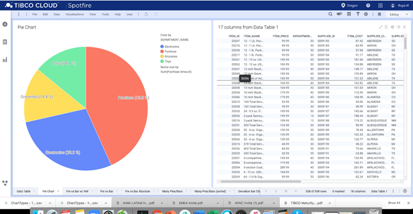
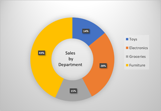
A pie chart may not be suitable for every kind of data. The below pie chart represents the proportion of sales made by various departments of a wholesale store.
Distinct parts
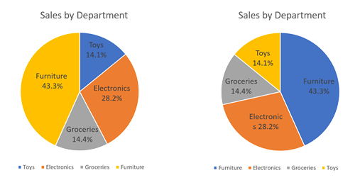
When the data comprises distinctive parts, a pie chart is best suited to represent it. The aim of using a pie chart is to compare the contribution of each part to the whole data. In the above example, the data is made up of sales from the furniture department (43.3 percent), electronics (28.2 percent), groceries (14.4 percent), and toys (14.1 percent). The chart visualizes how each department contributes to the total sales.
No time representation
A pie chart is suitable when data visualization doesn’t need to represent time. While some other types of graphs have a dimension that represents time, the pie chart doesn’t have one. In the above example, the sales data representation doesn’t indicate when these sales were made. Pie charts cannot represent the change in data over time.
Few components
A pie chart works best if the sample data only has a few components. In the above example, the sales data from the four departments are represented. As the number of categories increases, so does the number of slices. It might be challenging to interpret a pie chart with many small slices.
Easy visualization
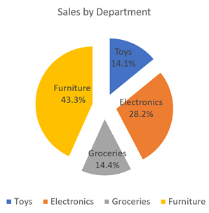
Pie charts are the best to visualize how much each category contributes to the sample data. In the above example, without even reading the numbers, it is easy to visualize that the furniture department contributes most to the organization’s sales.
What are the best practices when using a pie chart?
Sorting the slices of the pie chart according to size
A pie chart represents the contribution of each part of the data to a whole. The arc size of each slice is directly proportional to the contribution of that part. Therefore, it’s best to order the slices according to their contribution to the whole. A common practice is to place the biggest slice on the top-right side of the chart.
The chart on the left side is not ordered according to the slice size in the below example. The chart on the right side is ordered. It is easy to see that the chart on the right is simple to understand, while the unordered chart on the left looks a little cumbersome.
Merge the smaller categories
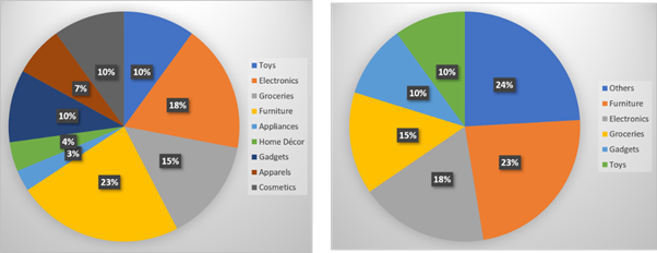
A pie chart is best suited for data that comprises only a few categories. When the number of categories increases, the size of the slices becomes smaller. It’s best practice to limit the number of slices to around five. When there are more than five slices, it is best to combine smaller categories. In the below example, the chart on the left side has nine categories. Combining the smallest three numbers into a single category provides a better representation.
Avoid unnecessary effects
Adding visual effects—such as a three-dimensional effect—might distort a pie chart. These effects are often applied for emphasis or better aesthetics. Sometimes, these effects are unnecessary and make the interpretation of the pie chart difficult. It is a best practice to add visual effects to pie charts only when it’s necessary.
Types of pie charts
Donut plot
A donut plot is a variation of the pie chart where the center portion of the chart is removed. The additional area in the middle of the chart can be used for adding extra labels to the chart. Both the pie chart and the donut plot have almost the same readability. In most cases, the choice between a pie chart and a donut plot is made based on aesthetic requirements.
3D pie chart
The 3D form is often used to improve the aesthetics of the pie chart. As we saw in the earlier section, a 3D pie chart may have less readability than a 2D pie chart. The extra dimension does not add any new information or hinder the ease of interpretation.
Exploded pie chart
In this variation, one or more slices of the pie chart are pulled apart from the center to give emphasis. While it improves the aesthetics of the chart, the exploded pie chart may affect the readability. It is crucial to use the exploded pie chart only if it’s necessary.
When not to use pie charts?
Don’t use pie chart to represent incompatible data
A pie chart is useful to represent data that is a part of a whole. As you can see in the above examples, the categories such as furniture, electronics, toys, and groceries are parts of wholesale data and add up to 100 percent. A pie chart does not make sense if it represents disjointed data and isn’t part of a whole data set.
Don’t use pie charts for data comparison
It is not a good idea to compare two pie charts for understanding the change in data over time. It is not easy to compare two pie charts slice by slice, and it’s often difficult to derive insights from such a comparison.
Don’t use pie charts for comparison between slices
While the pie chart gives a good idea of how different categories in the sample data contribute to a whole, it is not an excellent way to compare the slices. Comparing the size of the slices may not give a good sense of the difference between them. It might work if one slice is much bigger than the other, but the comparison based on slice-size may not work for numbers that are too close to one another.
What are the other charts to use instead of pie charts?
Pie charts have some drawbacks in data visualization. To interpret pie charts, there needs to be a comparison between the angle or area of slices. Comparing areas or angles are not as easy as comparing heights. Therefore, many organizations don’t believe that a pie chart is the right choice for data representation.
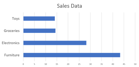
A common alternative for a pie chart is a bar chart. Also, a few other types of charts do an excellent job of accomplishing the features of the pie chart and visualizing the data more clearly.
Bar chart
A widely accepted alternative to the pie chart is the bar chart. Bar charts represent the different categories in a data set as bars of varying lengths. It is easier to compare the length of these bars than the area of the slices of a pie chart. The pie chart gives a more comprehensive view of how each part contributes to a whole. The bar chart offers a more precise comparison between different categories.
Waffle chart
A waffle chart is also known as a square pie chart. The waffle chart is in the form of a grid with 100 icons. Each icon in a waffle chart represents 1 percent of the data. A different color represents each data category on the waffle chart. The total number of icons for a particular category represents the proportion of that category to the whole data. Unlike the pie chart, each category is rounded off to a whole number in the waffle chart.
Stacked bar chart
A stacked bar chart can be an effective replacement for a pie chart to represent a whole-to-part comparison. A stacked bar chart is a rectangular counterpart of the pie chart. Compared to the pie chart, stacked bar charts are used less frequently.
