What is a map chart?
The function of a map chart is to position data and visualize spatial relationships using geographical context. Additionally, a map chart can visualize non-geographical data, such as wafer maps for manufacturing defect analysis or schematic diagrams for process control. Maps facilitate the tagging of specific metrics against locations or areas within a defined context, whether geographical or otherwise, and are crucial for comparing values and showing the variability of selected quantities across regions.
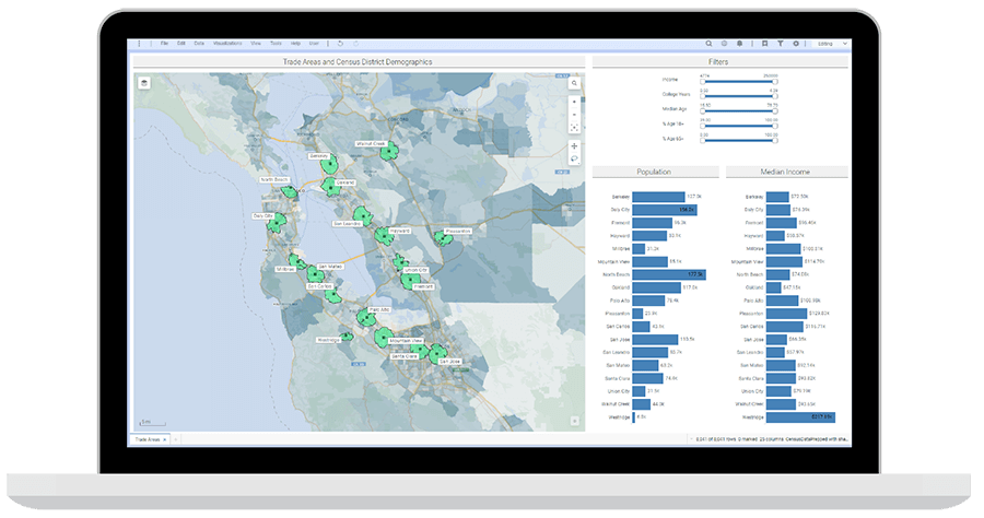
Example of a map chart
Figure 1 is an example of a map chart. The different US States are represented by interactive shapes or feature layers. Users can zoom in, mouse over, and select these states to find out more information on the data. The colors on these regions can represent different attributes of these shapes. Similarly, users can add points to a map; these are displayed by marker layers which indicate specific details in a topographical or spatial context.
Map charts are visualization tools that can achieve powerful data presentation goals. They are very attractive and easy to understand; however, as with any visualization, it is always important to design them with a goal in mind and to consider carefully whether they are the most appropriate choice for the task at hand.
When to use map charts
Individuals and organizations commonly use map charts when they need to visualize data comprehensively and compare it across regions for strategic decision-making purposes. Map charts provide important configuration options that help users visualize regional data and turn it to useful information. Maps are a great tool to help viewers understand size, location, and distance.
Map charts are an essential tool when you want to identify spatial patterns—whether the concept of space means representing a location on Earth, a defect on a wafer, or an area of human anatomy.
Map charts are invaluable for visualizing and analyzing data across different zones and contexts within the energy sector. They help reservoir engineers, completions & drilling engineers, production engineers, and process & equipment engineers make key decisions by providing a clear geographical or schematic context for their data.
In high-tech manufacturing, map charts are essential for process & equipment engineers, yield & defect engineers, and product & test engineers. They provide insights into spatial patterns and relationships within manufacturing processes and product testing.
For pharmaceutical scientists, clinical scientists, and process & equipment engineers in the life science R&D industry, map charts help support critical decisions by visualizing complex data—helping, for instance, clinical trial site selection, supply chain management, or equipment tracking for asset management.
In the following sections, we will give examples of how map charts can enhance your analysis.
Show geographical changes across data
Map charts are useful for visualizing the variability of target quantities across different locations. For instance, when analyzing market potential for new drugs in different regions or the yield and defect rate on manufactured wafers.
Demonstrate closeness
Map charts can help to visualize the distribution of elements of interest, especially with respect to their distance to points or areas of interest. For instance, they can help identify the number of drilling locations near an oil rig, the number of burglaries around a specific center, or how close customers live to their nearest store.
Show only matched items
Map charts help highlight specific regions or areas where critical data exists, such as underperforming factories or locations failing to meet certain criteria.
Facilitate interactions
Map charts allow for user interactions, providing options like zooming in and out, searching, and grabbing areas to drill down into specific spatial data.
Promote intuitive understanding
Map charts provide an intuitive way to understand data, making it easy to identify structures, trends, and outliers. The visual nature of map charts allows users to grasp complex data at a glance, which is particularly useful for decision-makers who need to quickly interpret and act on information.
Best practices when using map charts
As with all charts, there are a number of best practices to follow to create the most helpful and accurate visualization. The ones detailed below are particularly relevant for map charts.
Clean data
Ensure the dataset is clean and consistent before converting it to map charts. Data cleaning involves filtering out potential inaccuracies, ensuring consistency in naming conventions, and standardizing data formats. Data cleaning positively influences the outcomes and quality of map charts. Clean data is critical for producing accurate and reliable map charts.
Label effectively
Effective labeling enhances data visualization by making significant values and patterns in map data easily identifiable. This practice ensures that important points or areas are highlighted, aiding in critical decision-making.
Use visual cues
Design map charts to ensure users can easily comprehend the intended information. Use visual cues such as color gradients to emphasize important messages. For example, using color gradients to represent defect densities on wafers can make defect arrangement more apparent.
Format for accessibility
Ensure the readability of the visualized data in map charts for accessibility, consistency, and clarity. This involves eliminating unnecessary information that could draw the user's attention away from the intended message, making text legible, and ensuring borders are visible. Avoid overcrowding the map with too many colors, markers, or layers of information.
Be mindful of errors and distortions
Bias in data collection or presentation can skew the results, leading to incorrect conclusions. For example, inconsistent naming conventions or inaccurate location data can create misleading visualizations.
Maps inherently distort geographical areas, because of the projection of a spherical surface onto a flat plane. For instance, the size of a region on a map does not necessarily match its surface area. Always rely on additional information to aid visual perception, such as coloring a region by the value of its area.
Types of map charts
Scatter maps
Scatter maps enable users to visualize geographical or non-geographical data points as markers. They involve using different colors and sizes to distinguish data points on a map. Scatter maps allow creators to present details and to add value to a given work.
Bubble maps
Bubble maps are variations of the scatter maps where markers of different sizes represent the region's numeric value. One marker is used to represent one geographic coordinate or region, making them useful for visualizing data density or intensity, such as the concentration of specific test results.
Pie chart maps
Pie chart maps combine pie chart data and map in data visualization. It is a variation of scatter map charts with pie charts to show categorical data proportions at specific locations, making it easier to visualize locations and their numerical proportions.
Bubble pie maps
Bubble pie maps are a variation of pie chart maps where pies represent data points. The size of the pies is determined by values in the size field column. These maps enable users to compare and relate performances across multiple parameters, such as comparing various defect types and their frequencies across different areas.
Filled maps
Filled maps represent different regions (features) on the map using color to indicate specific measures or dimension criteria. Filled maps are ideal for visualizing regional performance metrics, such as production output across different regions.
Heat maps
Heat maps display data density or intensity using color gradients. These maps highlight areas with high or low concentrations of data points given specific criteria. This type is particularly useful in process quality troubleshooting and in identifying high defect and yield densities.
Features of map charts
Map charts come with a range of features that enhance their functionality and allow users to create detailed and interactive visualizations. Understanding these features is key to effectively utilizing map charts for various applications across different industries.
Geographic or spatial coordinates
Coordinates provide the ability to represent data on a map. Longitude and latitude values are essential for accurately positioning data points on a geographical map. In non-geographical contexts, such as wafer maps or schematic diagrams, similar coordinate systems are used to plot data points accurately within the defined area.
Layers
Map charts can include multiple layers styled individually to add depth and detail to the visualization. Common types of layers include:
Feature layers: Display specific geographical or schematic features, such as states, regions, or areas on a wafer.
Marker layers: Show data points or markers, which can be used to represent specific locations.
Map layers: Provide the base map on which other layers are overlaid.
Image layers: Allow the inclusion of images or diagrams for additional context.
Zoom visibility
Zoom functionality allows users to focus on specific areas of the map for detailed analysis. Each layer can have its own zoom range settings, ensuring that layers with excessive details can be hidden or revealed based on the zoom level. This feature enhances the usability of map charts by allowing users to drill down into specific regions or zoom out for a broader overview.
Interactive elements
Interactive features enable users to engage with the map chart, providing a more dynamic and informative experience. Common interactive elements include:
Zoom in and zoom out: Allows users to adjust the view to focus on specific areas.
Search functionality: Enables users to locate specific regions or data points quickly.
Grab and pan: Lets users move around the map to explore different areas.
Tooltips: Provide additional information when users hover over or click on specific data points.
Benefits of map charts
Map charts offer numerous advantages for visualizing and analyzing data across various contexts and industries.
Intuitive understanding
Map charts provide an intuitive way to understand data, making it easy to identify patterns, trends, and outliers. The visual nature of map charts allows users to grasp complex data at a glance, which is particularly useful for decision-makers who need to quickly interpret and act on information.
Enhanced spatial analysis
Map charts excel in visualizing spatial relationships and geographical data. For example, in the energy sector, reservoir engineers can use map charts to analyze geological formations, while in high-tech manufacturing, wafer maps can help identify defect patterns across different regions of a wafer.