
Unlock new levels of productivity and process insight with the latest Spotfire® Data Science innovation — the Overall Equipment Effectiveness (OEE) visualization. Modern manufacturing is driven by precision, performance, and productivity. Yet, even the most advanced facilities often struggle to clearly visualize how their equipment is performing across production lines, shifts, or plants. That’s where the new OEE visualization, exclusive to Spotfire® Data Science comes in.
This specialized visualization mod brings together the core metrics that define manufacturing excellence: Availability, Performance, Quality, and Overall Equipment Effectiveness — into a single, compact, and easy-to-read visual.
Turning performance data into operational insight
The OEE visualization is designed to do more than display numbers. It transforms complex production data into actionable intelligence, revealing where inefficiencies occur, how equipment is performing over time, and what actions can drive measurable improvement.
At its core, the OEE visualization shows four essential metrics that underpin manufacturing performance:
- Availability: How often equipment is running as planned.
- Performance: How efficiently it operates compared to its maximum capacity.
- Quality: How many products meet required specifications.
- OEE: The combined measure of all three, representing true manufacturing productivity.
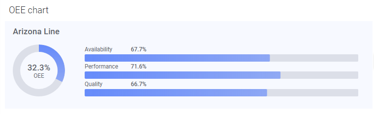
Each metric is represented on its own axis, with values ranging from 0 to 1 (or 0% to 100%), giving engineers, process analysts, and operations managers a clear picture of production health at a glance.
Beyond OEE: Enriching context with KPIs and performance thresholds
In addition to the four key OEE metrics, the visualization supports up to four supplementary KPI axes, allowing users to display related metrics such as energy consumption, output volume, or downtime hours. For instance, overlaying OEE with energy consumption instantly reveals which lines deliver the best yield per kilowatt.
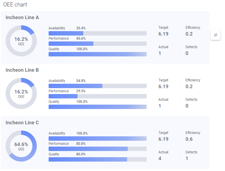
These customizable KPIs appear alongside the OEE bars, adding rich operational context and enabling users to connect process indicators to equipment performance — all in one unified visual.
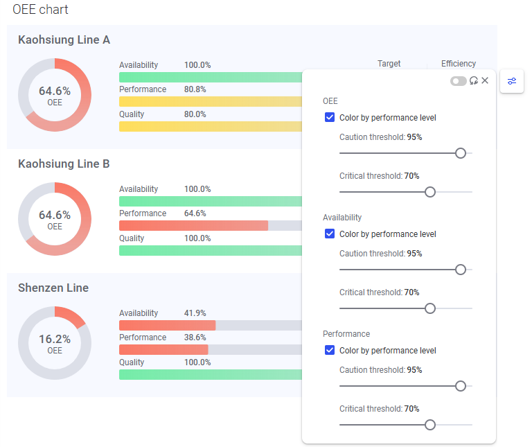
Color-coded performance thresholds (Good, Caution, and Critical) make it immediately clear where attention is needed. By adjusting these thresholds in the configuration panel, users can tailor the visualization to match internal benchmarks and production goals.
Designed for visual clarity and configurability
Like all Spotfire® Data Science visualizations, the OEE chart was built for clarity, flexibility, and collaboration. Through the configuration panel, users can:
- Adjust bar width, colors, and gradients to align with their dashboard design.
- Display or hide value percentages and customize decimal precision.
- Configure trellising by rows, columns, or pages to compare performance across lines, products, or shifts.
- Control KPI visibility and grouping for maximum readability.
These customization options make it easy to adapt the visualization to different production contexts — from single-line monitoring to multi-site operational reviews.
Interactive exploration for continuous improvement
True to the visual data science philosophy of Spotfire, the OEE chart isn’t static reporting; it’s fully interactive. Users can mark, filter, and drill into data points to uncover hidden trends or anomalies.
Clicking an OEE row highlights it across connected visuals, making it easy to trace underperforming assets, compare production lines, or correlate OEE with other process variables such as throughput or yield.
This interactive exploration empowers operations teams to seamlessly move from monitoring to root-cause analysis within a single, governed environment.
Exclusive to Spotfire® Data Science
The OEE visualization is available exclusively in Spotfire® Data Science, reinforcing the platform’s position as the most advanced environment for industrial and process analytics.
By combining visual-first data exploration with domain-specific analytics, Spotfire Data Science enables engineers, analysts, and data scientists to go beyond traditional dashboards — turning operational data into decisions that drive measurable performance gains.
You can access the OEE visualization directly from the Add-ons screen in Spotfire Data Science. Once installed, simply configure your OEE metrics (Availability, Performance, Quality, and OEE) and optional KPIs to start exploring your equipment performance in a powerful new way.
The new OEE visualization underscores the commitment Spotfire has to visual data science in industrial analytics. Whether you’re optimizing production lines in semiconductor manufacturing, managing uptime in energy operations, or improving yield in pharmaceuticals, Spotfire Data Science gives you the depth, intelligence, and synergy to make every decision count.
Spotfire Data Science, where visual analytics meets industrial intelligence.
Ready to explore? Start your free trial now. The Spotfire Data Science trial gives you the freedom to explore your data and gain faster insights for complex problem-solving. Start unlocking full-circle insights in Spotfire Data Science today.