In the previous installments of the From Data to Decisions blog series, we introduced Spotfire® Data Science as the new gold standard for industry-specific analytics and showcased the power of data functions, specifically built-in data functions that fast-track Spotfire Data Science analysis.
In the world of high-stakes analytics, it’s not just about collecting the right data—it’s about seeing it the right way. In this installment, we’re focusing on how Spotfire® Data Science transforms how organizations approach oil & gas-specific challenges, specifically with powerful, purpose-built visualizations native to Spotfire Data Science.
The visualization add-ons are more than just visual flourishes—they’re decision accelerators. Let’s explore how Spotfire Data Science visualization add-ons bring richer, sharper insight to mission-critical decisions across industries.
Built for industry experts, tuned for industry challenges
Spotfire Data Science Add-ons (specifically visualizations in this blog installment) are exclusive to Spotfire Data Science platform users. These extensions go beyond traditional charting—they’re domain-aware tools that embed industry-specific logic and visual storytelling directly into your analytics workflows.
Whether you’re optimizing reservoir recovery in energy or planning precision drilling activities, these add-ons bring clarity to complexity with interactive, deeply contextualized views of your data.
Always evolving, always supported
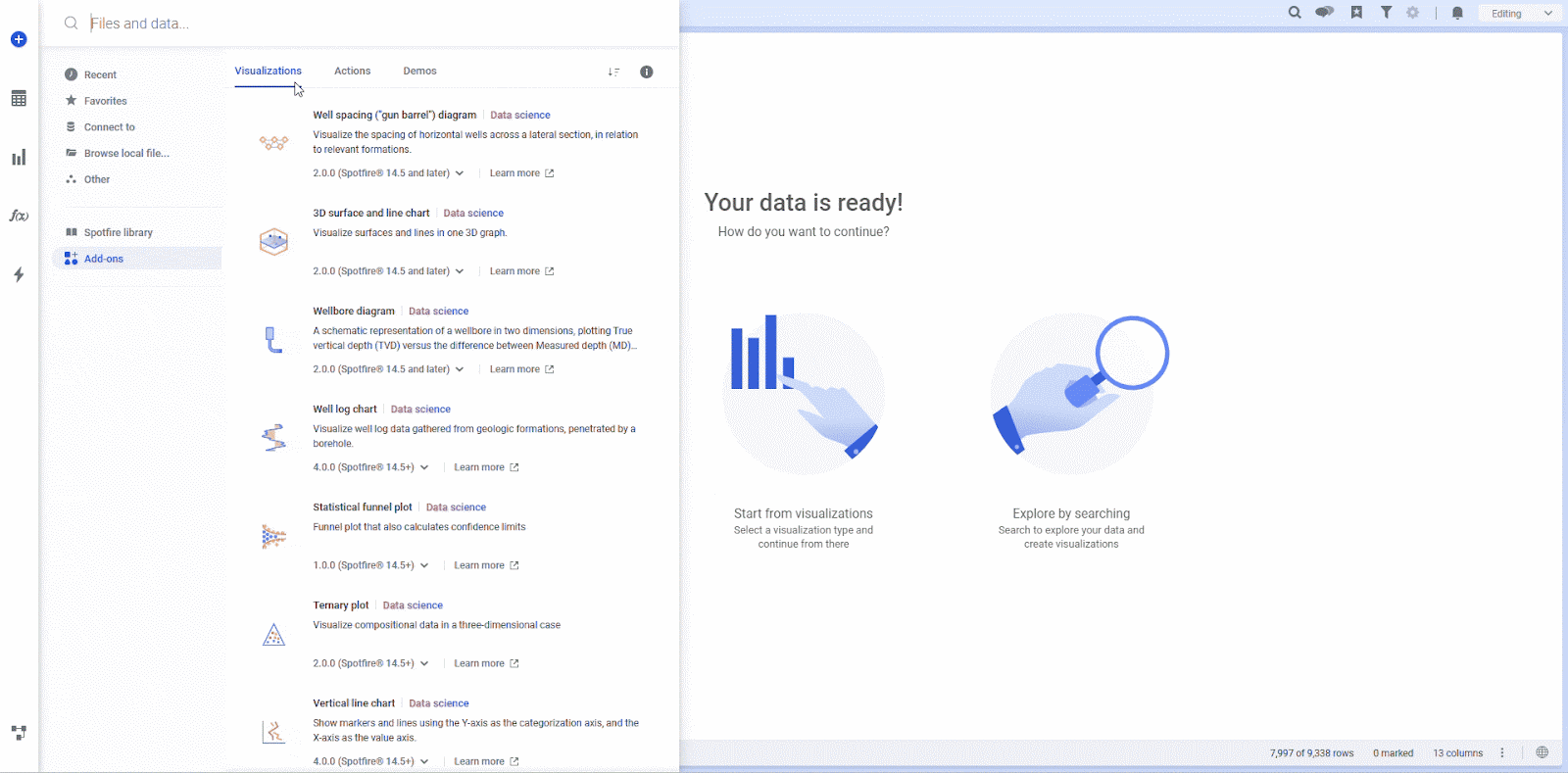
Add-ons are available through a dedicated repository within Spotfire Data Science, via direct integration with the Spotfire Community, and can be browsed and added without requiring a platform upgrade. New visualizations and actions are continuously published and are fully covered under Spotfire’s warranty and support. That means your analytics capabilities grow, without any operational drag.
This flexible deployment model ensures you’re always equipped with the latest innovations, whether you’re tackling long-standing operational questions or responding to emerging trends.
Oil & Gas-specific visualization add-ons
Here’s a closer look at a few of the high-impact visualizations available now:
Well Log Chart
Analyze geologic properties by depth to identify pay zones, estimate reserves, and guide completion activities. Customize tracks, mark depth regions, and work with both tall and wide data structures—this is a geoscientist’s power tool for reservoir insight.
See our first blog in the series for a spotlight on this visualization.
Well Spacing (“Gun Barrel”) Diagram
Visualize spatial relationships between wells to uncover drilling opportunities. Use overlays, interactive filters, and measuring tools to optimize reservoir coverage and production potential.
Wellbore Diagram
Get a detailed schematic view of the wellbore, from casing to plugs. Understand fluid positions and visualize key metrics, like temperature and proppant concentration, to plan safer and more efficient frac treatments.
3D Surface and Line Chart
Bring subsurface data to life with immersive 3D visualizations. Explore wellbore trajectories and formation intersections to optimize placement and improve recovery—all with an intuitive drag-and-zoom interface.
See it in action:
Easily add the 3D Surface and Line Chart to your analysis with Spotfire Data Science Add-ons.
Solving what matters most
Across industries, mission-critical decisions are increasingly data-driven but also increasingly complex. Spotfire Data Science Add-ons are built for exactly this reality. They give teams the tools they need to move fast, stay accurate, and tailor every insight to their domain.
From insight to action
These visualizations don’t live in isolation. They pair seamlessly with new Action Mod add-ons, enabling users to trigger workflows, tag data, or generate recommendations based on interactive selections.
In our next installment, we’ll focus on the Action Mods native to Spotfire Data Science. Curious to see the visualizations featured here in action? View our recent webinar on how Spotfire Data Science transforms energy analytics.
And if you’re ready to explore how these visualization add-ons can simplify your analysis and sharpen your decision-making, get in touch—we’d love to help you turn complexity into clarity.