While Spotfire is renowned for being intuitive and easy to use, we realize your users may come from many different backgrounds and experiences. Some may be brand new to using business intelligence tools; others may have a grasp of basic visualizations (scatter plot, line graph, boxplot, or pie chart) but are just getting started with more advanced visualizations (waterfall, graphical table, heat map, maps, and the like). Others might be unfamiliar with adding and replacing data or utilizing powerful new forms of data wrangling in Spotfire, and so on.
Therefore, this self-paced user enablement series is designed to give you and your Spotfire users exactly what they need to get up and running quickly and easily—no matter what level of experience you’re starting from. We accomplish this by using a scaled approach where the videos are split into different sets, depending on the experience of the viewer. Users can progress from the beginning if they are new to this, or jump in at a higher level if that’s more appropriate.
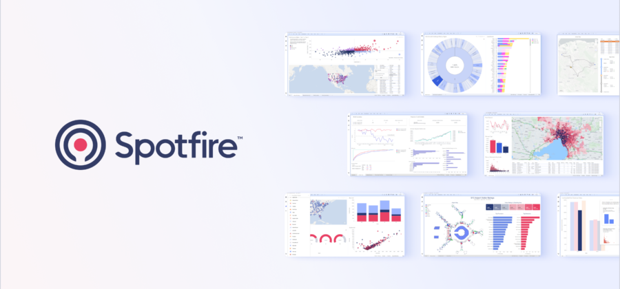
The first set of user enablement videos we’d like to introduce to you are targeted at users with absolutely no experience with Spotfire. Quickstart videos are only about twenty minutes in total duration. They make it easy to get the footing on topics such as what is Spotfire, how to interact with a dashboard, how to create a basic dashboard, and sharing and exporting.
Get started with Spotfire
Check out our YouTube to see more enablement videos like the one above. Check out our Get Started page to stay updated on all the latest training at Spotfire.