What is a funnel chart?
A funnel chart is a graphical representation used to visualize how data moves through a process. In a funnel chart, the dependent variable’s value diminishes in the subsequent stages of the process. Funnel charts are widely used to represent sales funnels, recruitment, and order fulfilment processes. For example, the below funnel chart represents different stages in the real estate sales process. The real-estate company starts its sales process by contacting prospective customers.
At the top of the funnel, they have 100 prospective customers. The real-estate company starts pitching their products to these customers, and only 60 people respond to the pitch. Then these 60 customers go through the next steps in the sales funnel. Only five customers finally purchased a real estate property from the company. The funnel chart below depicts this sales process. The length of each bar represents the number of customers at each stage of the sales process.
How do funnel charts represent data?
Funnel charts look similar to bar charts, except that the funnel chart has bars of diminishing length. In a funnel chart, the top most bar (also known as the “head” or “base” of the funnel) represents 100 percent data. The subsequent bars have lengths representing the proportion to the whole.
For example, the second bar in the funnel chart above represents the number of “pitched” customers. It has 80 percent of the size of the first bar. The last bar in the funnel chart is known as the “neck” of the funnel chart.
When to use a funnel chart?
A funnel chart is a very specific representation that only fits a certain kind of data. If the data has the following attributes, then funnel charts are a good fit:
- The data goes through a sequence of stages, and the number of stages is at least three.
- The data diminishes at each stage. The first stage has more items than the second. The second has more items than the third and so forth.
- The data is numerical, and there is a clear reduction of data at every stage.

What are the main uses of funnel charts?
Funnel charts are best suited to depict the change in a variable (in the above example, the number of customers) during a process. This could either be a sales process or a selection process.
In general, funnel charts are used for various purposes:
Visualize customer drop out
A typical sales process starts with a set of customers in the beginning. During the various stages of sales, some customers drop out. A funnel chart represents the proportion of customers who pass from one stage of the sales process to the next. In other words, the chart also represents what percentage of the customers have dropped from the sales process.

Visualize a selection process
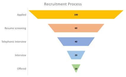
Funnel charts can also represent a selection process—like an interview or a competition. For example, assume that 100 candidates applied for a specific job. Only 60 of them passed through the resume screening. Forty of them passed through the telephone interview. The funnel chart below represents this interview process. It shows how many candidates were present at each of the selection process stages.
Visualize bottlenecks in a process
Funnel charts are extremely useful for identifying a bottleneck in a business process. For example, the funnel chart below shows a hypothetical email campaign process. In the below process, only 50 percent of customers who have opened the email are clicking on the embedded link in the mail. This may be due to an issue with the email. For example, the mail might be cluttered or not impressive so that most of the customers ignore it. A funnel chart can clearly visualize these kinds of issues in a process.

Visualize order-fulfilment
Order fulfilment evaluation in an electronics store is a perfect use case for a funnel chart. The head of the chart represents the number of orders originally received. The subsequent bars represent the number of orders processed, approved, shipped, and delivered.

What are the common variations of a funnel chart?
Funnel charts can be represented using various formats:
Inverted triangles
Funnel charts can be represented as an inverted triangle. The issue with representing a funnel chart as an inverted triangle is that a user is often tempted to associate the area of each segment to the actual value of the data. Instead of the area of the segment, the length of each segment represents the actual data.
Set of diminishing bars
A more accurate representation of a funnel chart is a set of bars, with each bar smaller in length than the one above it. In this representation, it is clear that the length of each bar represents the value of the data variable.
What are the best practices when using a funnel chart?
Use clear annotations
A funnel chart is an efficient visualization tool. Using clear annotations can make it better. Use meaningful and concise labels. Adding too much information into the labels will clutter the chart and confuse the viewer. It is a good practice to add the percentage values along with the raw data in a funnel chart. This gives a better understanding of the percentage drop in each stage of the sales or business process.
Use an effective color scheme
Using a color scheme for bars is an excellent way to enhance the clarity of a funnel chart. A common practice is to use different colors for each bar. The same color or a gradually changing gradient might confuse viewers.
Number of stages
Funnel charts fit data that passes at least through three stages. In the case of fewer steps, a pie chart or bar chart is more appropriate.
What are the advantages of funnel charts?
Funnel charts are easy to visualize
Funnel charts allow a user to visualize how a variable changes as it passes through different stages of a process. For example, in a funnel chart representing a recruitment process, each bar visualizes the number of candidates moving from one stage to the next.
Gives emphasis to processes
While most of the other charts represent data, the funnel chart also emphasizes the process. Funnel charts can visualize processes in different fields: recruitment, order fulfilment, website visitor behavior, and sales conversion process. Funnel charts are widely used by organizations to represent the health of their workflows.
Help to identify bottlenecks
Funnel charts are often used by the sales, marketing, and product teams to improve their processes. The funnel chart helps to visualize the bottlenecks in a process. Assume that the sales process has a particular stage where the number of customers drastically decreases. A funnel chart emphasizes such abnormalities. Funnel charts are beneficial in identifying potential issues and creating business strategies.
What are the disadvantages of funnel charts?
Only represents a single variable
Funnel charts can be used to represent only a single variable. They cannot be used to analyze the relationship between two or more variables.
Not suited for data analysis
Funnel charts give a high-level view of a process. It points out where the issues are but may not explain why the issue happens. As the data included in the funnel chart is very minimal, it might not be suitable for any data analysis. Funnel charts are best used as a first step towards understanding a process.
What are the other charts related to funnel charts?
Bar charts
In theory, funnel charts are the same as bar charts. While each bar in the bar chart is left or right-aligned, bars in a funnel chart are center-aligned. While bar charts do not necessarily represent a process, funnel charts are better suited for representing data flow through a pipeline.
Sankey diagram
A Sankey Diagram is another alternative to a funnel chart to represent a process flow. Funnel charts are suitable to represent simple, linear processes. Sankey diagrams can represent more complex workflows with multiple inputs and outputs.
